Gauge Charts
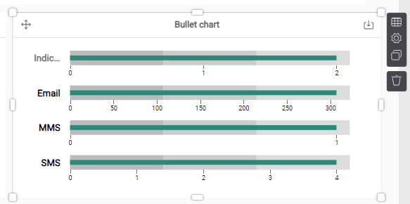
Bullet chart
A bullet chart is one of the best ways to show actual versus target comparisons. The blue bar represents the actual value. The small black line shows the target value and the coloring are performance bands.
When to use:
- When you have 1 measure, split over 1 hierarchy
- Make sure the hierarchy does not contain too many measures (best practice < 10)
- Setting of targets and measuring over the different targets
